
Home > Power BI Report Guides > tyGraph Pages (Legacy)
Download this articletyGraph Pages (Legacy)
This is a summary of all tooltips in tyGraph Pages. All tooltip items are brief descriptions of the visual and calculation, limited to 250 characters.
Content Overview
-
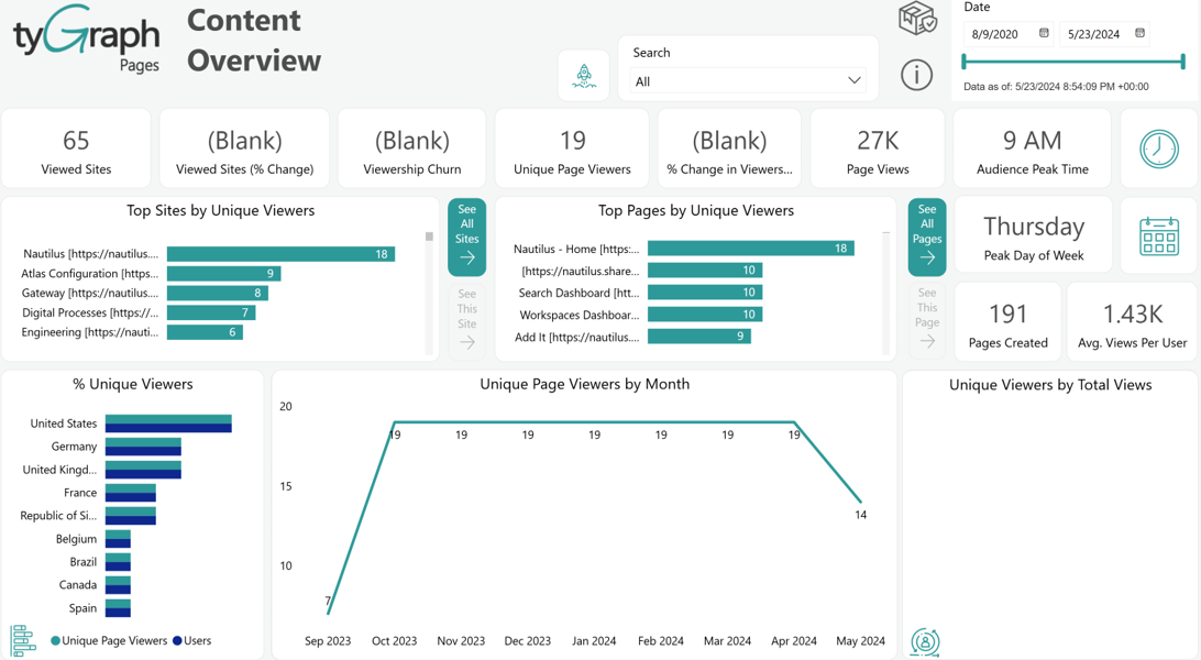
Viewed Sites – The total unique sites with views in the reporting period.
-
% Change in Viewed Sites – This is the percentage change in viewed sites from the previous period to the current one. The previous period is the range of dates behind the current period for the same number of days.
-
Viewership Churn – Churn % tells you the percentage of users who stopped viewing content during this period. This is calculated from the number of users that did not view this period but did in the prior period divided by the total previous and current viewers.
-
Top Sites by Unique Viewers – Sites ranked by the total unique viewers in the reporting period.
-
See All Sites – Select this button to go to a broad analysis of all your sites.
-
See This Site – Select the data bar of a site to the left and click this button to focus on the performance of your selected site.
-
Unique Page Viewers – The number of total unique page viewers. You can click on the neighboring data bars to see this based on a specific context, like page viewers for a top site or page.
-
% Change in Viewership – The percentage change in unique viewers from the previous period to the current one. The previous period is the range of dates behind the current period for the same number of days.
-
Page Views – This is the total number of page views for the reporting period. This will count each time someone loads a page. If you love a page and keep going back to it, then this is your kind of measure!
-
Top Pages by Unique Viewers – Top pages ranked by the unique page viewers. If someone views the same page multiple times in the same period, they are only counted once.
-
See All Pages – Select this button for a broad analysis of all your pages.
-
See This Page – Select the data bar of a site to the left and click this button to focus on the performance of the selected page.
-
Audience Peak Time – This card shows the peak time when the largest number of users are active or engaged in the reporting period.
-
Peak Day of the Week – The day of the week with the most unique page viewers totaled across the report period. So if you have more than one week in your report period, it will bundle multiple days underneath the same day. You can click to see a detailed plot below.
-
Pages Created – The total number of pages created in the reporting period is not in a “Draft” or “Pending” status. If you click Plot this below button, you can see the list of recently created pages below this card.
-
Avg. Views Per User – The average number of page views per user in the reporting period, where page views are divided by the unique number of page viewers.
-
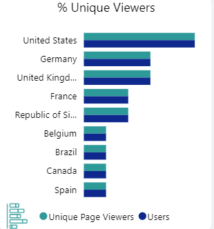
% Unique Viewers – The total unique viewers compared to the total viewers ever recorded from that location. You can rotate through a range of visualizations by clicking the icon in the bottom left. You can also pivot by Province/State or city using the arrows at the top.
-
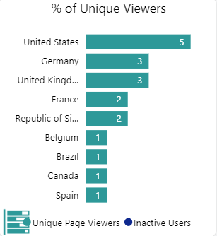
% of Unique Viewers (Inactive) – An inactive user has viewed from that location before but did not in the reporting period. You can rotate visualizations by clicking the bottom left icon. You can also change granularity using the arrows at the top.
-
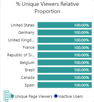
% Unique Viewers Relative Proportion – A visualization of unique viewers vs. inactive users by percentage. This allows you to rank by the most engaged areas. You can rotate visualizations by clicking the bottom left icon. You can also change granularity using the arrows at the top.
-
Unique Page Viewers by Date – The number of unique page viewers over time. This visual contains a dynamic date hierarchy allowing you to change the bottom axis to fit your situation. Use the double down arrow to move down and the up arrow to move up.
-
Total Unique Viewers by Page Views – The total unique viewers by their total views in the reporting period. If users return to content often, this will have a gradual slope. However, if users often only view once, you will have the majority of users in the 1-3 category, and then a long tail.
Content Navigator
-
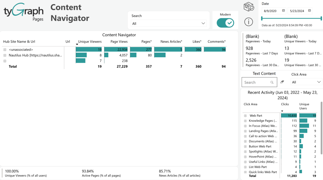
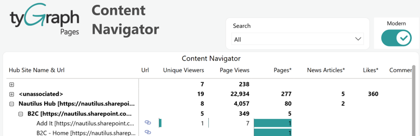
Content Navigator – Summary statistics by Hub Site/Site/Page. You can navigate this hierarchy using the plus symbols on the left. If you are running a classic structure, you can use the modern/classic toggle to switch to a better layout for viewing subsites. Columns marked with an asterisk (*) represent the current state as of the latest refresh.
-
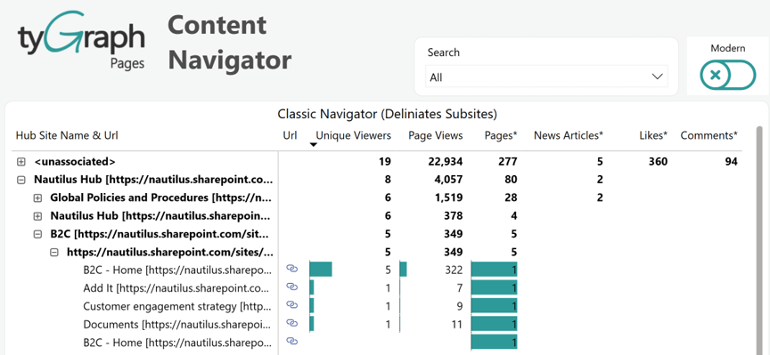
Classic Navigator (Delineates Subsites) – Summary statistics by Hub Site/Site/Subsite/Page. You can navigate this hierarchy using the plus symbols on the left. If you use a modern structure, you can use the modern/classic toggle to switch to a better layout for viewing subsites.
-
View summaries – Summary statistics for recent viewers and views.
-
Text Content Search box – There are many elements that a user can click on in SharePoint. If you’re interested in a certain element you can search for it here and see it reflected in the total clicks below.
-
Recent Activity (date range) – Total clicks and the number of unique users clicking by element name. If the element does not have a label, we use the element class or the surrounding name. The Recent Activity displays data based on the Detail Period (days) parameter.
-
Summary percentage – Summary based on statistics in the table above. You can select various levels above to see these percentages in the context of your selection.
Content Health
-
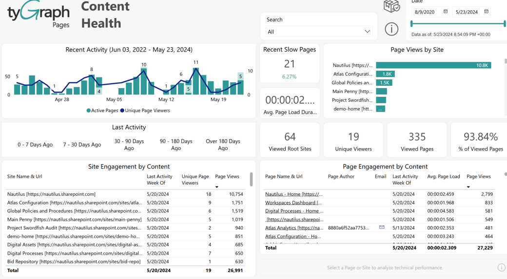
Recent Activity – Total viewed pages and unique page viewers over time. This visual contains a dynamic date hierarchy allowing you to change the bottom axis to fit your situation. Use the double down arrow to move down and the up arrow to move up.
NOTEThe Recent Activity displays data based on the Detail Period (days) parameter.
-
Last Activity – Use this to select pages that have last had activity within the range of dates. For example, select pages where the last view was 90-180 days ago. You can either delete these pages or remove references to them on your site menus.
-
Recent Slow Pages – Sometimes people stop using pages because they are slow, not because the content is poor. This totals the number of pages that load in over five seconds. You can sort by the Avg. Page Load column in the bottom right chart to see which is the slowest.
-
Avg. Page Load Duration – The average time for pages to load in your selection.
-
Viewed Root Sites – The total number of root sites with views in the report period.
-
Page Views by Site – This visual shows pages ranked by the total number of page views they have accumulated.
-
Unique Viewers – The total number of unique page viewers in the report period.
-
Viewed Pages – The total number of pages in your selection.
-
% of Viewed Pages – The percentage of viewed pages within your selection.
-
Site Engagement by Content – A list of all sites that have not had any views in the above selection.
-
Page Engagement by Content – A list of all pages that have not had any views in the above selection.
News Explorer
-
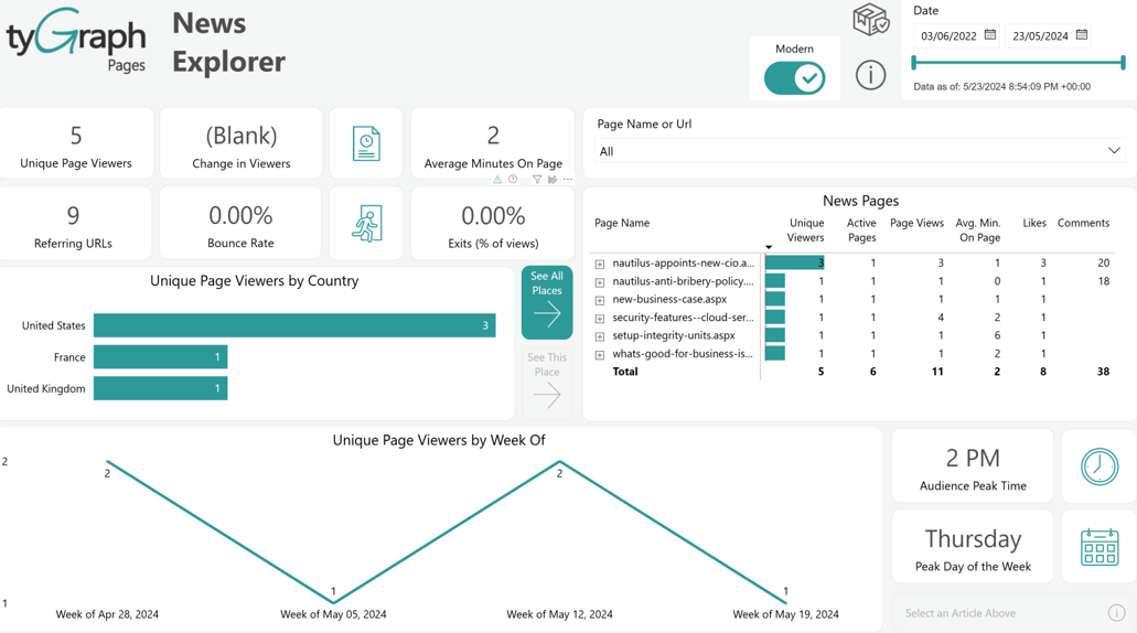
Unique Page Viewers – Total number of unique page viewers in the reporting period.
-
Change in Viewers – The percentage change in unique page viewers from the previous period to the current one. The previous period is the range of dates behind the current period for the same number of days.
-
Average Minutes on Page – The average number of minutes a user spends on the selected news pages.
-
Referring URLs – The total number of sources that people come to your news pages from. See the Page Performance report page for a full list of these source URLs and how many views came from each direction.
-
Bounce Rate – The percentage of people who view your page and then immediately leave. This suggests how many people stumbled upon your article, but it wasn’t what they were looking for.
-
Exits (% of views) – The percentage of your views where your article(s) were the last thing the viewer looked at before ending their browsing session. This is usually a good thing as it indicates that the user found what they were looking for.
-
Unique Page Viewers by Country – A ranking of location by unique page viewers. This gives you a pulse on where your audience is from. See the Audience Location page for details. This visual contains a dynamic location hierarchy allowing you to see the province or city.
-
Audience Peak Time – This card shows the peak time when the largest number of users are active or engaged in the reporting period. You can click here to see a detailed plot below.
-
Peak Day of the Week – The day of the week with the most unique page viewers totaled across the report period. You can click to see a detailed plot below.
-
Unique Page Viewers by Week Of – The number of unique page viewers over time. This visual contains a dynamic date hierarchy allowing you to change the bottom axis to fit your situation. Use the double down arrow to move down and the up arrow to move up.
-
Page Name or URL Search box – Search for your news article by name or the article location here.
-
News Pages – A full list of your news pages by popularity. You can navigate within this using the + / - on the left edge. If you’re on a classic site, you can use the modern/classic switch at the top for a nicer layout that reflects the nesting of subsites.
Engagement Overview
-
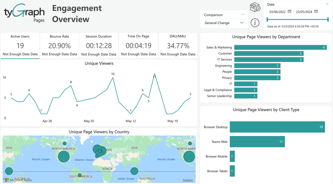
Active Users – Total Unique Viewers in the reporting period. The item at the bottom of the box is the percentage change in unique viewers from the previous period to the current one.
-
Bounce Rate – The percentage of page views where the user leaves immediately. The item at the bottom of the box is the percentage change in bounce rate from the previous period to the current one.
-
Session Duration – The average session duration in the reporting period. A session is the end-to-end time someone spends browsing on the platform regardless of the site or page. The item at the bottom of the box is the percentage change from the previous period to the current one.
-
Time On Page – The average time on page in the reporting period. The item at the bottom of the box is the percentage change from the previous period to the current one.
-
DAU/MAU – The ratio of users on the platform on a monthly level vs. a daily level. The bigger the gap, the less frequent users are on your platform.
-
Unique Page Viewers – A plot of unique viewers in the reporting period. This visual contains a dynamic date hierarchy allowing you to change the bottom axis to fit your situation. Use the double down arrow to move down and the up arrow to move up.
-
Unique Page Viewers by Country – A total of unique users by location. Select a location dot to focus the above visuals on a certain location.
-
Unique Page Viewers by Department – The total unique viewers by a deep hierarchy: Department / Country / State/Province / City / AD Location.
-
Unique Page Viewers by Client Type – The total unique viewers by a deep hierarchy: Client Type group /Client Type / Operating System Group / Operating System / Browser Group/ Browser.
-
Comparison – The time intelligence trend comparison calculations dropdown selector.
-
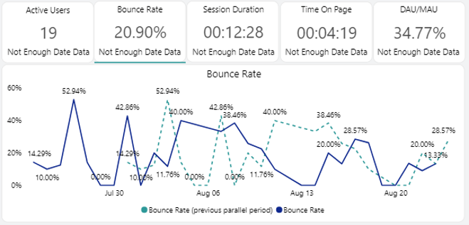
Bounce Rate – A plot of bounce rate in the reporting period. This visual contains a dynamic date hierarchy allowing you to change the bottom axis to fit your situation. Use the double down arrow to move down and the up arrow to move up.
-
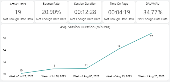
Avg. Session Duration – A plot of session duration for the reporting period. This visual contains a dynamic date hierarchy allowing you to change the bottom axis to fit your situation. Use the double down arrow to move down and the up arrow to move up.
-
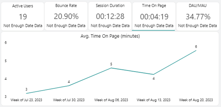
Avg. Time on Page – A plot of average time on page in the reporting period. This visual contains a dynamic date hierarchy allowing you to change the bottom axis to fit your situation. Use the double down arrow to move down and the up arrow to move up.
-
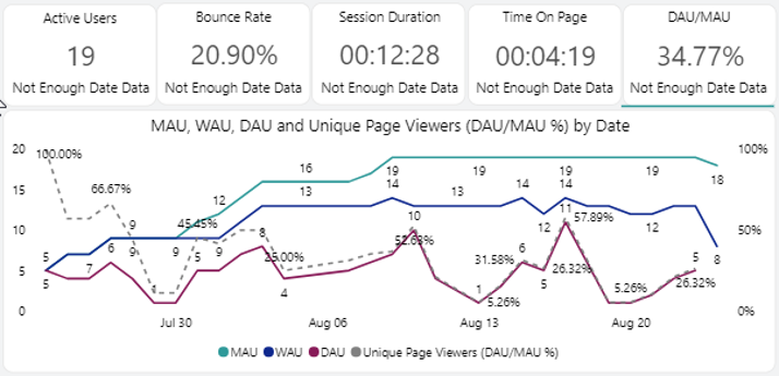
MAU, WAU, DAU, and Unique Page Viewers – A plot of Monthly, Weekly, and Daily Active users over time. (MAU, WAU, and DAU Respectively). The dotted line is the ratio between the MAU line and your DAU line.
Site Audience
-
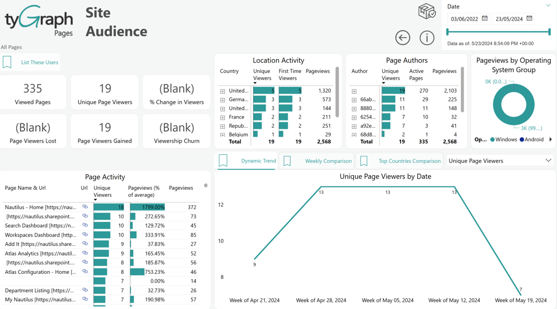
List These Users – To see a detailed list of some measures (unique viewers, viewers lost, viewers gained, first time viewers) down to a country, province, or city level.
-
Viewed Pages – The total unique pages with views against them in the reporting period.
-
Unique Page Viewers – The total unique page viewers on any pages within the site(s) for the report period.
-
Unique Page Viewers KPI – This is the % change in unique page viewers from the previous period to the current one. The previous period is the range of dates behind the current period for the same number of days..
-
Page Viewers Lost – This is the total unique users who viewed pages in the previous period but did not in the current period.
-
Page Viewers Gained – This is the total unique users who viewed pages in this period but did not in the previous period.
-
Viewership Churn – Percentage of users who stopped viewing content during this period. This is calculated from the number of users that did not view this period but did in the prior period divided by the total previous and current viewers.
-
Location Activity – A breakdown by country, province, and city. You can use the up and double down arrows at the top of the chart to change the row detail level.
-
Page Authors – Summary statistics by Page Author. Have friendly competitions between your page owners, search for the best Authors to promote content, or compare notes to see what methods work best to engage your audience.
-
Page Views by Operating System Group – A percentage breakdown of views by device. This contains a large dynamic hierarchy allowing you to visualize this by the following: Client Type/ Operating System Group/ Operating System/ Browser Group/ Browser.
-
Page Activity – Your top pages for the site(s) ranked by unique viewers, their relative percentage of views, and total pageviews. Pageviews % of average is the difference in views for that page vs. the average for all pages listed in this table.
-
Dynamic Trend – A plot of your selected measure (from the top right) over time. This visual contains a dynamic date hierarchy, allowing you to change the bottom axis to fit your situation. Use the double down arrow to move down and the up arrow to move up.
-
Weekly Comparison – A plot of your selected measure (from the top right) week over week for each day.
-
Top Countries Comparison – A plot of your selected measure (from the top right) over time for the top ranking countries. You can control the number of countries shown in the visual filter. This visual contains a dynamic date hierarchy, the same as the others.
Page Performance
-
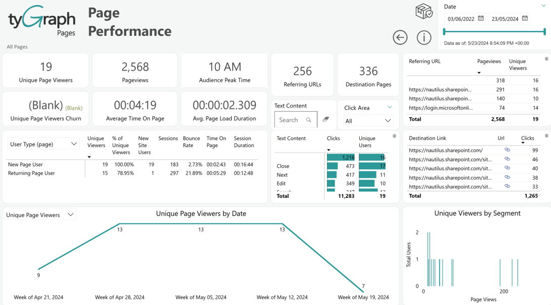
Unique Page Viewers – Total unique page viewers in the reporting period.
-
Page Views – The total number of page views in the reporting period.
-
Audience Peak Time – This card shows the peak time when the largest number of users are active or engaged in the reporting period.
-
Unique Page Views Churn – The percentage of users who stopped viewing content during this period. This is calculated from the number of users that did not view this period but did in the prior period divided by the total previous and current viewers.
-
Average Time on Page – The total time spent on your selected page divided by page visits for the reporting period. A page's session duration is capped in 30 minutes.
-
Avg. Page Load Duration – The average time it takes for your page(s) to render or load to the user. The color indicates how slow the page is. Research shows that users begin to get annoyed after five seconds.
-
Referring URLs – The total unique sources that users arrived at your selected page(s) from. See the list of Referring URLs to the right for a detailed list of each source and the number of views from each referring URL.
-
Destination Pages – The total unique URLs that users left to, after visiting your page. See the list of destination page URLs to the right for counts and a detailed list of each of the destinations.
-
Referring URL – This is a list of URLs that your users arrived on your page from. You can sort by either total views or the unique number of users by URL. A user can still be counted multiple times from each distinct URL, however, the total will still be distinct.
-
Text Content box – There are many elements that a user can click on in SharePoint. If you’re interested in a certain element, you can search for it here and see it reflected in the clicks below.
-
User statistics – A full breakdown of several user statistics by the factor that you have selected on the left drop-down.
-
Total clicks by element name – If the element does not have a label we use the element class or surrounding name. Be careful as this does not cross-filter to the surrounding visuals.
-
Destination Page URL – This is a list of URLs that your users left to from your page(s).
-
Unique Page Viewers by Date – A plot of your selected measure (from the top right) over time. This visual contains a dynamic date hierarchy allowing you to change the bottom axis to fit your situation. Use the double down arrow to move down and the up arrow to move up.
-
Unique viewers by segment – The total unique viewers by their total views in the reporting period. If users return to content often, this will have a gradual slope. However, if users often only view once, you will have a majority of users in the 1-3 category then a long tail.
Search Activity
-
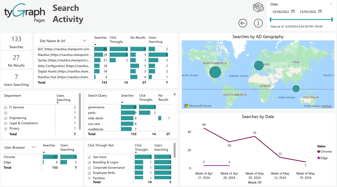
Searches – This card shows the total number of searches on a particular page for the reporting period.
-
No Result Searches – This card shows the total number of 'No Results' found for any searches on a particular page for the reporting period.
-
Users Searching – This card shows the total number of users who did the searches on a particular page for the reporting period.
-
Searches by Site Name & URL – This table shows the stats of total searches, click-throughs, no results found for any search, and the number of users doing the searches on sites for the reporting period.
-
Searches by AD Geography – This map shows the search stats (number of searches and number of users who are doing the searches) by geographical location for the reporting period.
-
Searches by Department – This table shows the number of users who searched based on search queries, job titles, and departments for the reporting period. You can drill up and down to see the numbers for different levels.
-
Search Query – This table shows the number of total searches, click-throughs, and no results found for search queries for the report period.
-
Searches by User Browser – This table shows the total number of searches and the number of users who did the searches based on Client types, Operating Systems, and Browser types for the report period.
-
Searches by Click Through Text – This table shows the total number of click-throughs and the number of users doing the searches based on Username, clicked link, and click-through text hierarchy level for the report period.
-
Searches by Date – This line chart shows the search stats over time. It can be drilled down/up to see the stats for different date hierarchy levels (i.e. yearly, quarterly, monthly, weekly, daily, period of the day, hourly, etc.) for the reporting period
Metadata Engagement
-
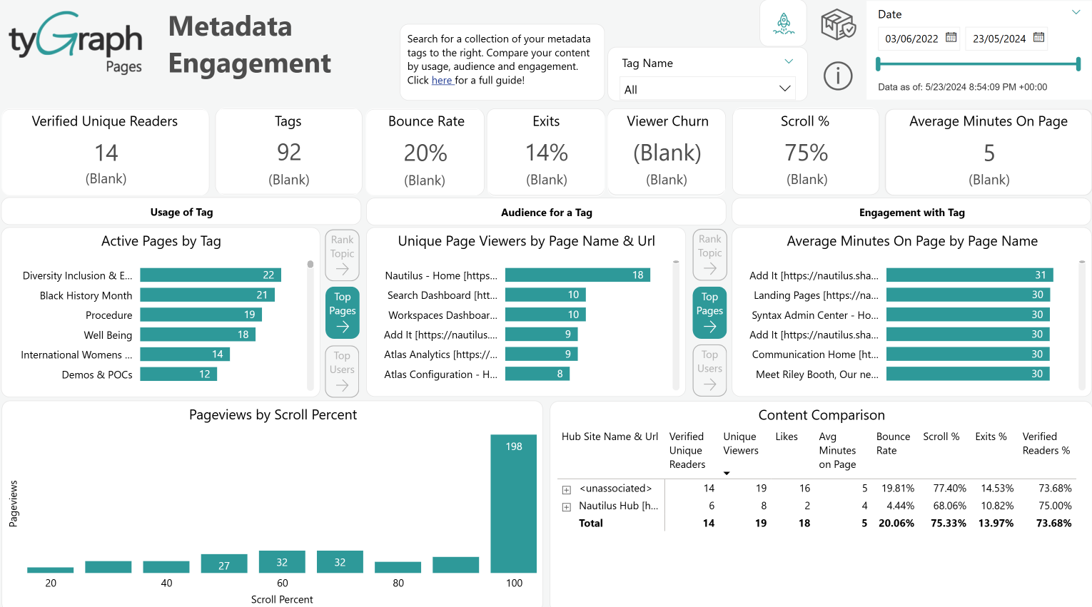
Verified Unique Readers – This card shows the total number of verified unique readers who have had a minimum read time (minutes) and scroll distance down the page for the reporting period.
-
Tags – This card shows the total number of tags/unique topics used for the reporting period.
-
Bounce Rate – This card shows the bounce rate for the reporting period. Bounce rate means the percentage of views where the person viewed and immediately backed out. The lower the percentage is, the better. Below 10% is excellent, around 20% is good, and above 40% is generally bad.
-
Exits – This card shows the exit rate of viewers for the reporting period. An exit is the last page view in a user's session. Exits are important to measure because they indicate that users stopped their session with your content. This could be good or bad, depending on the view duration and purpose of the page.
-
Viewer Churn – This card shows the viewer churn for the reporting period.
-
Scroll % – The card shows the scroll percentage of the pages for the reporting period. If a page renders their screen without a scroll bar, those views are not counted.
-
Average Minutes on Page – This shows the total amount of average time spent (in minutes) on a page for the reporting period.
-
Active Pages by Tag – This bar chart shows the count of active pages by tags for the reporting period.
-
Unique Page Viewers by Page Name & URL – This bar chart shows the number of unique page viewers of the active pages by tags for the reporting period.
-
Average Minutes on Page-by-Page Name – This bar chart shows the total average minutes spent on the active pages by tags for the reporting period.
-
Pageviews by Scroll Percent – This chart shows the counts of verified unique readers, tags/unique topics, bounce rate, exits percentage of views, unique page viewer churn, scroll percentages, and avg. time on page by different date hierarchy levels: (daily, weekly, monthly, quarterly, and yearly) for the reporting period. We can drill up/down to see the stats from different time levels.
Campaign Analysis
-
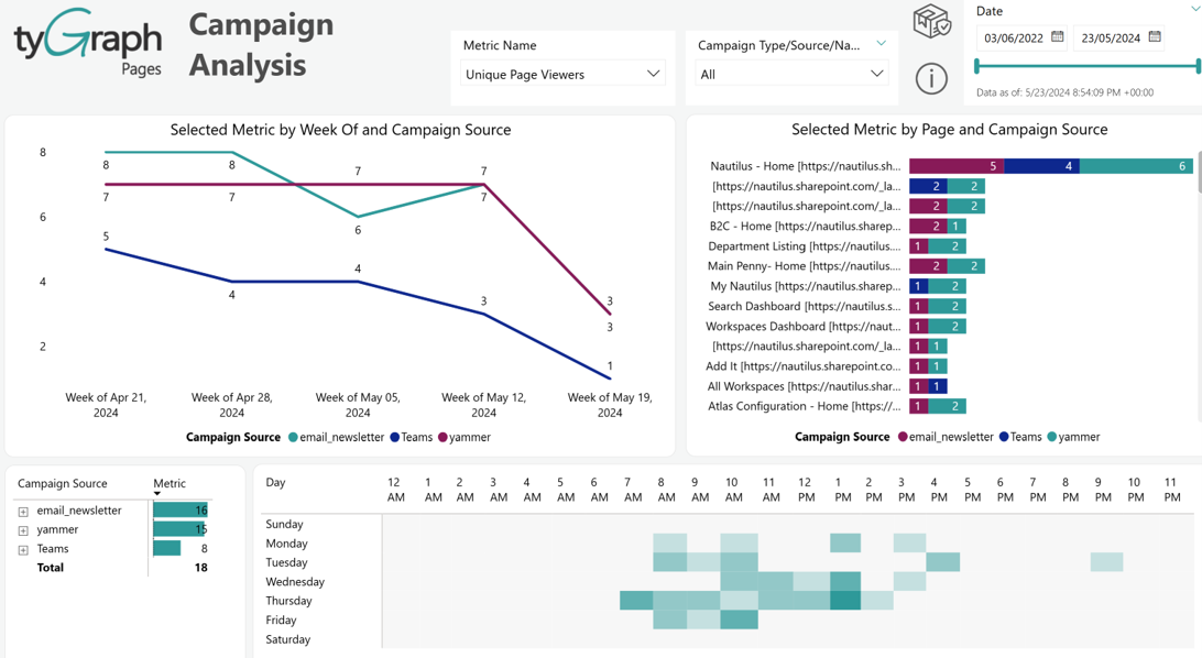
Metric Name – This slicer lets users choose which KPI to analyze (e.g., Unique Page Viewers, Pageviews, Average session duration, first time viewers, & sessions). All visuals update based on this selection.
-
Campaign Type/Source/Name - This slicer filters data by specific campaign categories or channels (e.g., email, Teams, Yammer) which helps narrow down analysis.
-
Selected Metric by Campaign Source over time (Line Chart) - This chart shows how the selected metric changes over time. Each line represents a different campaign source, enabling comparison. This chart is useful for tracking campaign performance trends.
-
Selected Metric by Page and Campaign Source (Stacked Bar Chart) - This chart breaks down the selected metric by individual pages. Each bar is split by campaign source contribution. This chart highlights which pages and channels drive the most engagement. This is useful for analyzing content effectiveness and traffic sources.
-
Campaign Source Summary (Table Visual) - This table aggregates the total values of the selected metric by campaign source. This chart helps identify the top-performing campaign source briefly. This is useful for high-level performance insights.
-
Day & Time Heatmap – This visual displays engagement distribution across days and hours. This highlights peak activity periods with higher intensity and helps determine the best times to run campaigns or post content. This is useful for optimizing timing strategy for engagement.
Weekly Active Users
In tyGraph Pages, Weekly Active Users refers to the total number of unique users who viewed a page in the last seven days of the specified date.
We plot this overtime to give you an understanding of how many users you can expect to hit content at any point in a 7-day period.
How do we interpret WAU?
WAU allows you to see how many users you attract in a week. As a point in time its best compared to your Daily and Monthly Active users. The difference between these values helps you understand the "stickiness" of your hub, site, or page. Your WAU trend can also be used as an early warning for user churn.
- WAU vs Daily Users
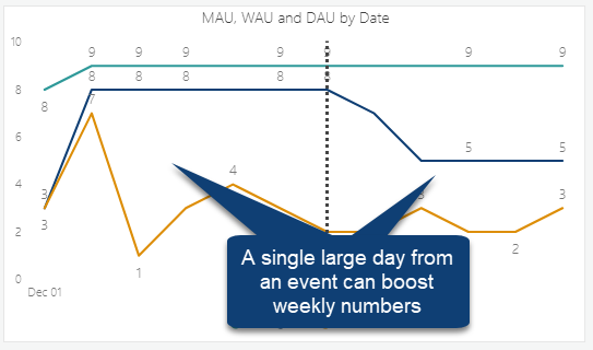
Weekly Active Users provide an excellent goal for single-day active users. If you have a day that equals or approaches your weekly active users, then you engaged as many people in a day as you would expect to spread across an entire week.
Checking your Daily active users also provides context to see if weekly users are the result of consistent user traffic or from a single event.
WAU vs Monthly Users
Similarly, the distance between your weekly and monthly active users tells you a great deal about your audience behavior.
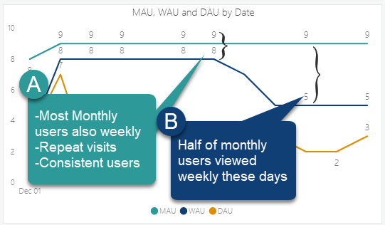
WAU Trend
The trend of your WAU score particularly compared to your MAU score can be an early sign of user churn.
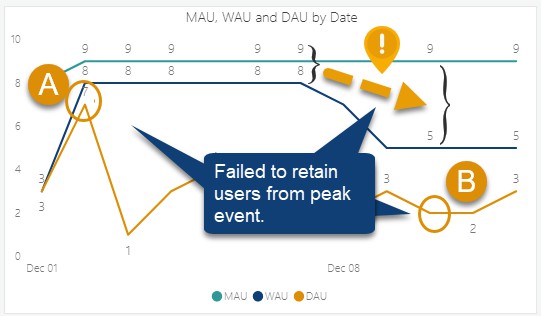
We can use this trend to compare the expected total number of users in a week with the number of users logging in each day. If users are logging in daily, these trends will be very similar.
Monthly Active Users
In tyGraph Pages, Monthly Active Users are the total unique users who viewed a page within the last 30 days of the given date
We plot this overtime to give you an understanding of how many users you can expect to hit content at any point in a monthly period. This measure provides an excellent baseline for how many users are generally on the platform.
How do we Interpret MAU?
Monthly active users MAU represents the total number of unique users who interacted with your content at least once in a given month. This metric serves as a ceiling for potential engagement within your audience – it reflects your maximum reachable user base but does not inherently measure depth of engagement or loyalty.
This provides you with a value to compare with your weekly and daily active users. The closer WAU or DAU are to your Monthly Active users, the larger portion of your population is engaging with your content. If you can make your WAU and MAU similar for a consistent period of time, then you have content which users return on a weekly basis. If you would really like to challenge yourself, try to have your Daily Active Users very similar to your Monthly Users. This is the essence of the DAU/MAU ratio, which compares daily to monthly users. The closer the lines, or the higher the DAU MAU ratio the stickier your content is. For example, Instagram is said to have a 60% DAU/MAU. See this article for details: DAU/MAU Ratio topic in the Analytics and Reporting FAQs.