
Home > Power BI Report Guides > tyGraph Pulse
Download this articletyGraph Pulse
tyGraph Pulse provides insights into the major collaborative workloads in Microsoft 365 like Outlook, OneDrive, SharePoint, Teams, and Yammer. Value is added by providing HR and organizational information to the data with additional context provided through geography and time scale data points. Pulse is where you should start your analytics journey into Microsoft 365 for adoption and usage.
Below is a summary of all help tips on the latest tyGraph Pulse report. Help tips are brief descriptions of the visual, explanations on how to use the visual, or details about the calculation. They can be found at the top of any visual by hovering over them.
Report Layout

-
The Logo will redirect you to our website: AvePoint tyGraph and will indicate which product or group of products this report will be about. For example below is the report of an overview of Microsoft 365 product adoption and usage, so it's cleverly named as 'Pulse'.
-
The Box icon – Hover over this to see the version of the report and database information. Click on this button to go to the tyGraph Dev Blog, where you can learn about changes/additions to the report.
-
Date slider – This is a rolling filter that is enabled by default. Use this to select a rolling range of recent dates. You can erase this slicer to select specific dates (below) outside the rolling range. You can glance at the “Report Period" element at any time to see the overall filter.
-
Harvest date – This is the most recent datapoint collected by tyGraph. If the date is behind what you expect, check if the dataset has refreshed. If you are on tyGraph Online, please contact support or your Admin immediately.
Microsoft 365 Adoption Overview
-
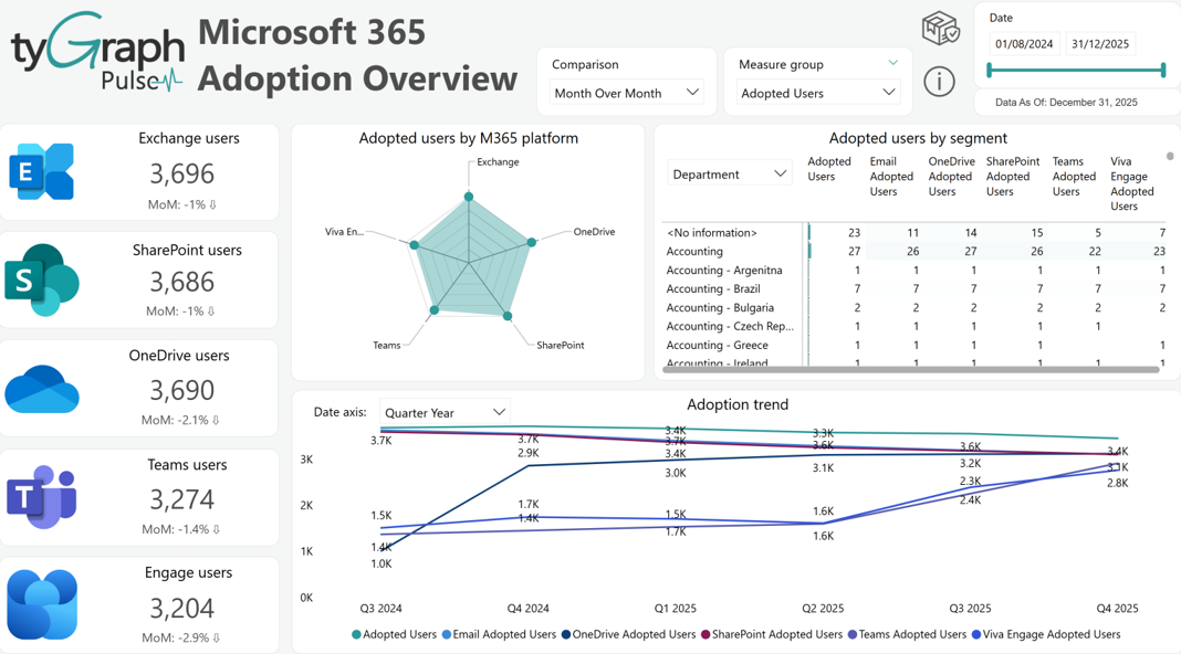
Time Intelligence Comparison – This slicer contains the time comparisons that get projected into the fields located directly below each Microsoft product card. Want to see the month-over-month trend of your digital transformation scores? Simply select it in the drop down and you will see the percentage change along with the corresponding trend icon up or down for each product.
-
Measure Group – This is a new feature that contains groups of measurements, allowing one to configure the below line graph and matrix by the preferred measurement category. The Microsoft Adoption page is populated with % of adopted users, % of user activities, the sum of adopted users, and the sum of total user activities. Combining these two slicers is a powerful feature allowing for 39 different configurations of the matrix and 18 different data views of the line graph.
-
Exchange Active Users Card – The total unique active users in Exchange for the reporting period. An active user has sent, received, or read email content. You can click the icon to the left to navigate to the specific Email activity Page.
-
Exchange Active Users Trend – A period comparison field that will show the percentage change along with a trend indicator depending on which time intelligence comparison has been selected in the "Comparison" slicer located in the header. For example, you can select "Month over Month" to see the percentage change from this month over the last month.
-
SharePoint Active Users Card – Displays the total unique active users in SharePoint for the reporting period. An active user has either Edited / Viewed Files, Synced, Shared Files, or Viewed Pages. You can click the icon to the left to navigate to a specific activity report.
-
SharePoint Active Users Trend – A period comparison field that will show the percentage change along with a trend indicator depending on which time intelligence comparison has been selected in the "Comparison" slicer located in the header. For example, you can select "Month over Month" to see the percentage change from this month over the last month.
-
OneDrive Active Users – The total unique active users in OneDrive for the reporting period. An active user has either Edited/Viewed Files, Synced Files, or Shared Files. You can click the icon to the left to navigate to a specific activity report.
-
OneDrive Active Users Trend – A period comparison field that will show the percentage change along with a trend indicator depending on which time intelligence comparison has been selected in the "Comparison" slicer located in the header. For example, you can select "Month over Month" to see the percentage change from this month over the last month.
-
Teams Active Users – The total unique active users in Teams for the reporting period. An active user has either chat messages, channel messages, voice calls, or meetings. You can click the icon to the left to navigate to a specific activity report.
-
Teams Active Users Trend – A period comparison field that will show the percentage change along with a trend indicator depending on which time intelligence comparison has been selected in the "Comparison" slicer located in the header. For example, you can select "Month over Month" to see the percentage change from this month over the last month.
-
Engage Active Users – The total unique active users in Viva Engage for the reporting period. An active user has either posted, read, or liked a message in Engage. You can click the icon to the left to navigate to a specific activity report.
-
Engage Active Users Trend – A period comparison field that will show the percentage change along with a trend indicator depending on which time intelligence comparison has been selected in the "Comparison" slicer located in the header. For example, you can select "Month over Month" to see the percentage change from this month over the last month.
-
Adopted Users by M365 Platforms – Allows you to easily spot which platforms are most popular. This is best cross filtered by an organizational unit on the left to see patterns within the business. You can also select the dots of products to focus on their trend over time in the chart below.
-
Adopted Users segment – Provides adoption statistics within your Active Directory Org Structure. The orders are Organization, Department, Job Title, User Email, User Region, User Country.
-
Date Slicer – Rather than using the up and down arrows (left of your cursor) to change the hierarchy order of the x-axis. Use the easy to locate date x-axis slicer embedded within the line graph to navigate to your desired date period.
-
Adoption trend – The total unique users with activity in the given product over time displayed in line graph form. You can use the embedded x-axis date slicer to change the aggregation of the x-axis rather than the traditional drill down arrows native to Power BI. The hierarchy orders are Year, Quarter Year, Month Year, Week, Date, and Day of Week.
Digital Transformation - Adoption and Usage
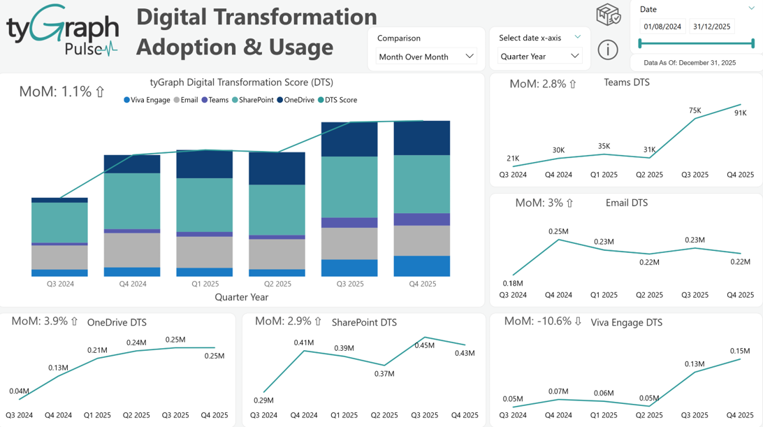
This section gives an overview of how your tenant is performing across Microsoft 365 workloads.
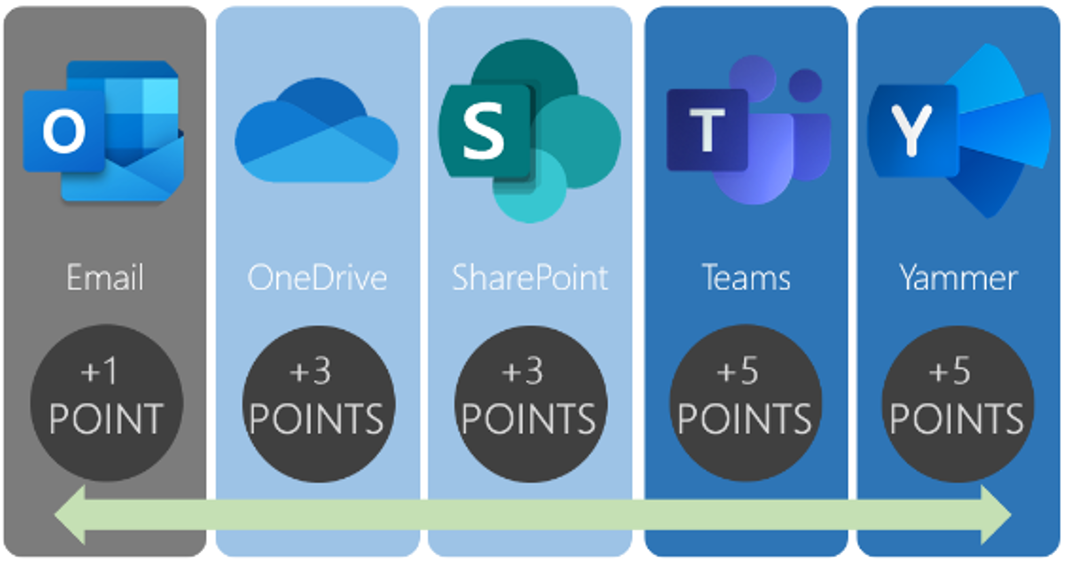
Multiple Microsoft 365 applications
Digital Transformation – Adoption and Usage
-
Time Intelligence Comparison – This slicer contains the time comparisons that get projected into the fields embedded in the top left corner of each visual on this page. Want to see the month over month trend of your digital transformation scores? Simply select it in the drop-down.
-
Date X-Axis Slicer – This slicer contains common date periods (Year, Quarter Year, Month Year, Week, Date, and Day of Week) for the x-axis on all the visuals present on this page.
-
tyGraph Digital Transformation Score (DTS) – Tells your digital transformation story. This is a weighted score that awards points based on user activity across Microsoft 365 Platforms.
-
Teams DTS – Scores Teams activity for users for the time frame and selection. Each day a user chats, has a meeting, posts a channel message, or has a voice call they get five points. This should be going up as you adopt Teams.
-
Email DTS – Scores email activity for users for the time frame and selection. Each day, a user sends or reads an email they get one point. For most companies, this slowly levels off, and then sometimes declines for companies with high Teams and Yammer usage.
-
OneDrive DTS – Scores OneDrive activity for users in the time frame and selection. Each day a user has file activity in OneDrive for Business, they get three points.
-
SharePoint DTS – Scores SharePoint activity for users for the time frame and selection. Each day a user has Viewed, Edited, Synced, Shared Files, or Visited a Page, they get three points.
-
Viva Engage DTS – Scores Viva Engage activity for users for the time frame and selection. Each day a user has Posted, Read, or Liked a message, they get five points.
Digital Transformation Detail
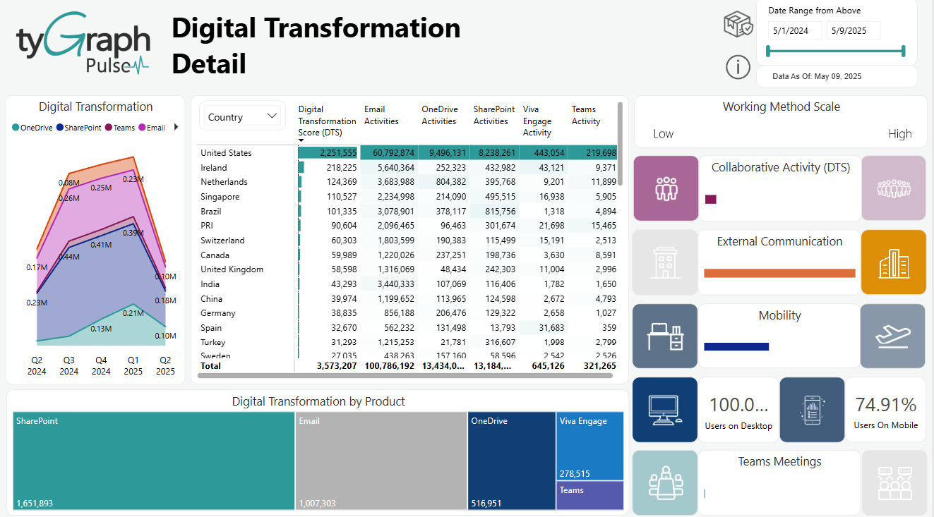
This allows you to understand the usage persona of various areas of the business.
-
Digital Transformation Stacked Area Graph – Shows each product's digital transformation score stacked on top of one another. This demonstrates visually the past trends of your digital adoption and transformation over the time selected. It's easy to see over time which direction you're going in for each product and compare different time periods without additional selections.
-
Country, Department, and other User Attributes Slicer – This contains common user fields that are useful for a business to filter by such as job title, organization, department, country, region, and user email. These fields reflect what is populated in your Microsoft Entra ID. This slicer is used to configure row categories in the below matrix.
-
Digital Transformation Score Matrix – Shows exact totals for organizational insights and usage details including Digital Transformation Score (DTS), and summed activities for the following products: Email, OneDrive, SharePoint, Viva Engage, and Teams. This matrix is configurable by the left slicer as well as more granular filters, such as 'User Department' and 'User Country' etc.
-
Collaborative Activity (DTS) – Is the average collaborative adoption level of users. Users are categorized each day into five stages of collaborative adoption where 1 is joining a tool and 5 is highly collaborative actions such as using SharePoint documents with other users.
-
External Communication – Shows the percentage of external sharing for a specific selected org unit such as department or country as compared to the entire organization. If you select a specific unit, it will cross filter that visual to show how externally collaborative it is compared to the whole organization.
-
Mobility Overall – This is the propensity for a user or collection of users to have mobile usage. Calculated as the average of desktop and mobile usage. This is intended to show the balance of someone’s days spent in each fashion.
-
Users on Desktop – Shows the percentage of days that users had desktop usage.
-
Users on Mobile – This is the percentage of days that users had Mobile usage.
-
Teams Meetings – This shows the average number of meetings per day for the selection of users. We assumed 16 meetings as the reasonable maximum. (8-hour workday with 30-minute meetings ~16 possible per day).
-
DTS by Product Tree Map – Shows a visual representation proportionally of tyGraph’s Digital Transformation Score by each Microsoft 365 product. The larger the square the larger the DTS score on the respective product. DTS scores are determined using days of activity multiplied by the respective weighted application score. This is a weighted score that awards points for user activity across Microsoft 365 products.
Your Pulse
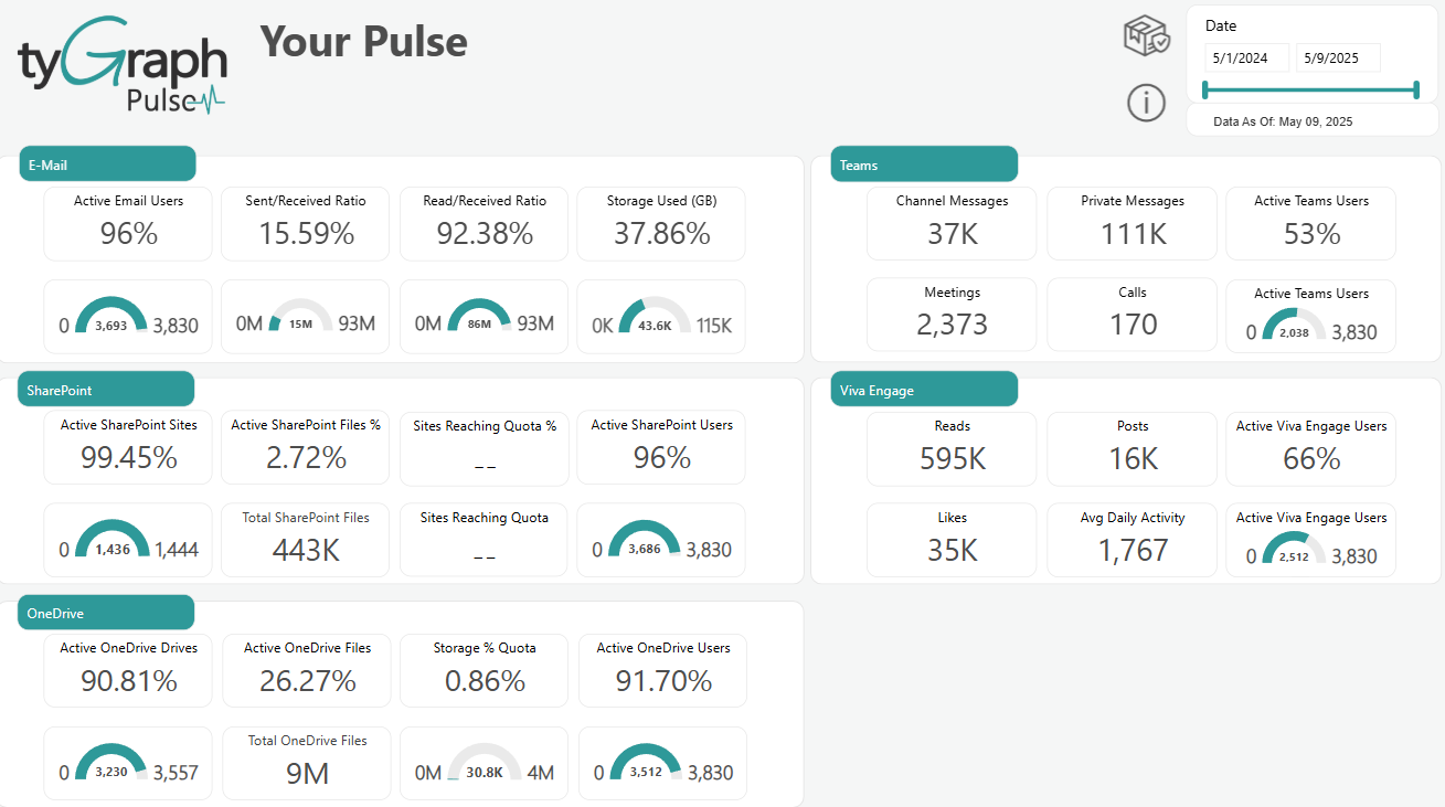
-
Active Email Users – This is the ratio of Active email users to all email users which is expressed as a percentage. For a user to be considered as “active”, they must have read, received, or sent an email message.
-
Gauge chart below Active Email Users – Compares Active email users to all email users. For a user to be considered as “active”, they must have read, received, or sent an email message.
-
Sent/Received Ratio – shows the ratio of emails Sent to Received which is expressed as a percentage.
-
Gauge chart below Sent/Received Ratio - Compares the total number of emails Sent to Received.
-
Read/Received Ratio – This is the ratio of emails Read to Received which is expressed as a percentage.
-
Gauge chart below Read/Received Ratio - Compares the total number of emails Read to Received.
-
Storage Used (GB) – Shows the ratio of email storage used to the email storage Limit which is expressed as a percentage.
-
Gauge chart below Storage Used (GB) - Compares the total Used email storage to the email storage Limit. This is expressed in gigabytes (GB).
-
Channel Messages – The total Teams Chat/Channel messages for all teams.
-
Private Messages – Shows the Total user to user(s) Teams messages for the reporting period.
-
Meetings – Determines total Teams meetings for the reporting period.
-
Calls – Shows the total Teams voice calls for the reporting period.
-
Active Teams Users – The ratio of Active Teams users to All licensed users within the tenant. This is expressed as a percentage. For a user to be considered as “active”, they must have received a Chat Message, a Private Chat Messages, or participated in a Call or Meeting.
-
Gauge chart below Active Teams Users – Compares Active Teams users to all licensed users within the tenant. For a user to be considered “active”, they must have received a Chat Message, a Private Chat Messages, or participated in a Call or Meeting.
-
Active SharePoint Sites – The ratio of Active sites to the total number of sites. This is expressed as a percentage. For a site to be considered “active”, there must be file activity (saved, synced, modified, or shared) or page views within the site.
-
Gauge chart below Active SharePoint Sites - Compares Active sites to the total number of sites. For a site to be considered “active”, there must be file activity (saved, synced, modified, or shared) or page views within the site.
-
Active SharePoint Files % – Shows the ratio of Active files to All files which is expressed as a percentage. For a file to be considered “active”, it must have been saved, synced, modified, or shared.
-
Total SharePoint files – Total SharePoint files as of the latest harvest date.
-
Sites Reaching Quota % – Percentage of sites with activities during the selected period exceeding 80% of their individual storage quota.
-
Total SharePoint sites exceeding 80% of their individual storage quota.
-
Active SharePoint Users – Shows the ratio of Active users to All licensed users within the tenant. This is expressed as a percentage. User activity includes pages visited, files synced, file views/edits, files shared externally, and files shared internally.
-
Gauge chart below Active SharePoint Users - Compares Active users to All licensed users within the tenant. User activity includes pages visited, files synced, file views/edits, files shared externally, and files shared internally.
-
Reads – The total number of Viva Engage Reads for the reporting period.
-
Posts – The total number of Viva Engage Posts for the reporting period.
-
Likes – The total number of Viva Engage Likes for the reporting period.
-
Avg Daily Activity – Shows the average number of daily Viva Engage activities for the reporting period. Viva Engage activities include reads, likes, and posts.
-
Active Viva Engage Users – The ratio of active Viva Engage users to all tenant users. This is expressed as a percentage. For a user to be considered “active”, they must read, like, or post.
-
Gauge chart below Active Viva Engage Users – Compares active Viva Engage users to all tenant users. For a user to be considered “active”, they must read, like, or post.
-
Active OneDrive Drives – Show the ratio of active OneDrives to the total number of OneDrives. This is expressed as a percentage. Any OneDrive on which users viewed, modified, uploaded, downloaded, shared, or synced files is considered “active”.
-
Gauge chart below Active OneDrive Drives - Compares active OneDrives to the total number of OneDrives. Any OneDrive on which users viewed, modified, uploaded, downloaded, shared, or synced files is considered “active”.
-
Active OneDrive Files – The ratio of active OneDrive files to the total number of OneDrive files across all users. This is expressed as a percentage. A file is considered “active” if it has been saved, synced, modified, or shared.
-
Total OneDrive files – Total OneDrive files as of the latest harvest date.
-
Storage % Quota – Shows the ratio of consumed OneDrive storage to the total amount of storage allocated for the reporting period. This is expressed as a percentage.
-
Gauge chart below Storage % Quota – Compares the total amount of storage consumed by all users in OneDrive to the total amount of storage allocated for the reporting period. This is expressed in gigabytes (GB).
-
Active OneDrive Users – The ratio of active OneDrive users to all tenant users. This is expressed as a percentage. Any OneDrive on which users viewed, modified, uploaded, downloaded, shared, or synced files is considered “active”.
-
Gauge chart below Active OneDrive Users – Compares active OneDrive users to the total number of OneDrive users. Any OneDrive on which users viewed, modified, uploaded, downloaded, shared, or synced files is considered “active”.
Predicting Teams Adoption
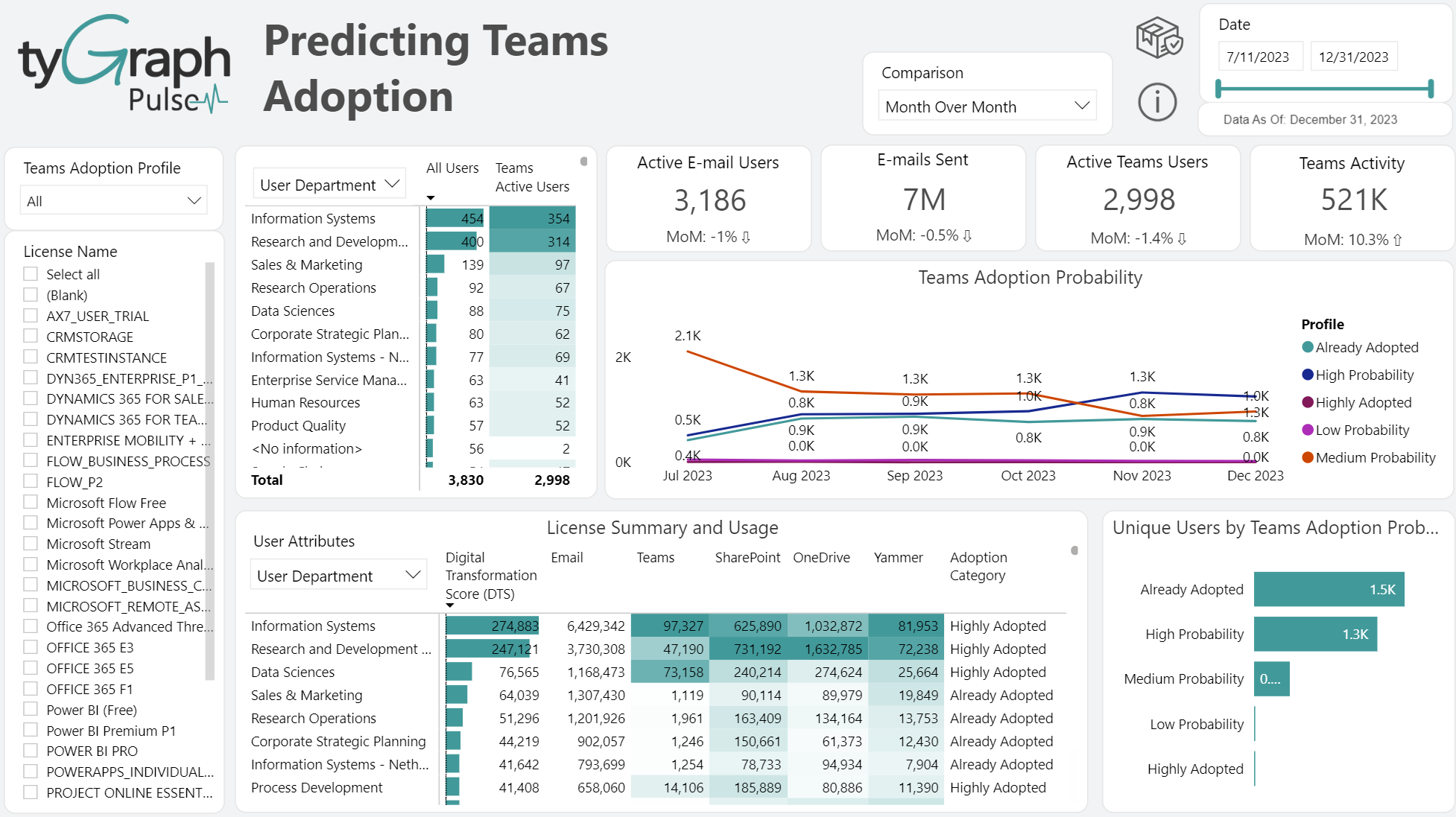
-
Time Intelligence Comparison – This slicer contains all the time intelligence period comparisons such as month over month period over period, first over last full month, and year over year.
-
Team Adoption Profile – A drop-down slicer containing all the different categories of Teams Adoption Probabilities such as (high probability, low probability, medium probability, already adopted etc.). You can filter relevant visuals to the right by these categories.
-
License Name Selections – A check box-based data filter allowing the user to filter relevant visuals to the right of it by selected Microsoft license types/names.
-
User Attributes Slicer – A feature allowing the matrix to be configured by the user attribute desired, such as department or country.
-
Active Teams Users Matrix – Sum of All Users versus Teams Active Users by "User Attributes" slicer which contains (Organization, Department, Job Title, and User email). This table locates dark spots in your organization where users are not active in Teams.
-
Active E-mail Users Trend – Indicates if e-mail users are higher or lower compared to the previous report period that is selected in the time intelligence comparison slicer at the top center of the page.
-
E-mails Sent Card – Indicates the summed number of e-mails sent out for the date period selected in the top right hand corner date slicer. This can also be filtered by the license type check box filter on the left-hand side.
-
Active Teams Users Card – Shows the summed total of active Teams' users for the date period selected in the top right corner date slicer. This can also be filtered by license type check box in the left-hand side
-
Teams Activity – The total number of unique Teams users activity. For a user to be considered as “active”, they must have received a Chat Message, a Private Chat Messages, or participated in a Call or Meeting.
-
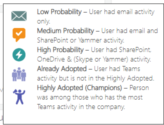
Teams Adoption Probability by Profile – Shows total unique users by their probability to adopt Teams. For details see the “License Summary and Usage” help tip.
-
License Summary and Usage – Shows your digital transformation score along with summed user-level usage activity and adoption by Microsoft 365 application. The rows in this matrix are configurable by the user attributes.
-
Unique users by Teams Adoption Probability – Categorizes users by their probability to adopt Teams.
License Enablement
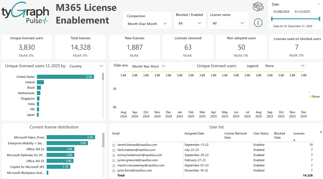
-
Time Intelligence Comparison – The same classic time comparison slicer that is present throughout this report offering popular time comparisons to be projected below the KPI cards spread along the row below it. You will see common business changes over time, month over month, and year over year, etc.
-
Blocked vs. Enabled Slicer – This slicer allows the user to filter the relevant visuals by enabled and then blocked users.
-
License Name Slicer – The same slicer that is present on a few other pages; this filters visuals by Microsoft license type/names.
-
Unique Licensed Users Card – This is a sum of the unique number of currently licensed users for your selected products. Click the button to display details on unique licensed users over time in the below bar and line graph visuals.
-
Unique Licensed Users Trend – Displays the change of unique licensed users in percentage form depending on the time comparison selected in the 'Comparison' slicer.
-
Total Licenses Card – The total number of licenses currently assigned, given your selection of various data filters. Click the button to display details on total licensed users over time in the below bar and line graph visuals.
-
Total Licenses Trend – Displays the percentage change in total licenses along with a trend arrow.
-
New Licenses Assigned Card – Shows the total new licenses assigned for the reporting period. Click the button to display details on new licensed users over time in the below bar and line graph visuals.
-
New Licenses Trend – Shows the percentage change of total new licenses assigned depending on which time comparison has been selected in the filter at the top of the page.
-
Licenses Removed Card – The total number of licenses removed. Click the button to display details on licenses removed over time in the below bar and line graph visuals.
-
Licenses Removed Trend – Shows the percentage change of licenses removed depending on which time period comparison has been selected in the filter at the top of the page.
-
Non Adopted Users Card – Shows the total unique licensed, not deleted users with no activity in 180 days. These users create a great opportunity to drive engagement or shift their license to those needing it more. Click the button to display details on "Non-Adopted Users" over time in the below bar and line graph visuals.
-
Non Adopted Users Trend – Shows the percentage change of "Non-Adopted Users" depending on which period comparison is selected in the filter at the top of the page.
-
Licenses Used on Blocked Users Card – The total licenses which are still active on users with blocked credentials. A blocked account in Microsoft Azure Active directory cannot be used. These accounts should be re-enabled or the licenses de-provisioned.
-
Licenses Used on Blocked Users Trend – The percentage change in total licenses still active on users with blocked credentials. The selection in the time comparison slicer determines the time compared.
-
Select Date Periods filter – A new feature to tyGraph reports that replaces the Power BI drill-down icons that can be hard for users to locate, providing a more pleasant user experience. Use this to configure the line graph in middle embedded in by common time periods (Year, month, week, etc.).
-
Current License Distribution – Shows the organizational license assignments and consumption by each License. This allows you to see your license limits at a glance and decide on areas that are at or approaching capacity.
-
User List – A list of user e-mails in a hierarchical form that, when opened, exposes which licenses are assigned to each respective user e-mail showing the assigned date, removal date, blocking date and corresponding statuses.
Microsoft 365 Product Adoption
-
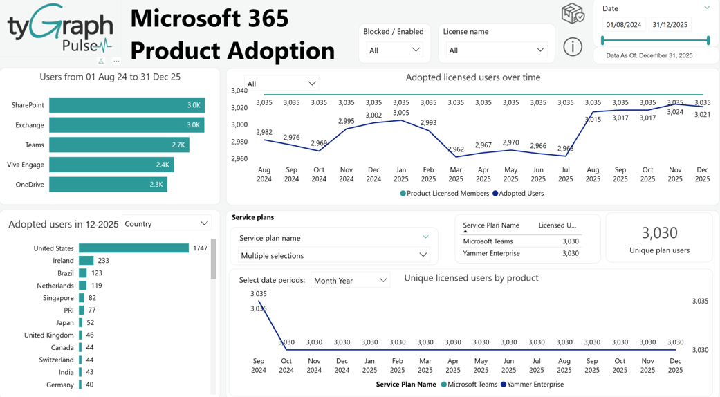
Adopted Users For Report Period by Platform – This bar chart shows the number of users who have adopted the selected platform (Exchange, OneDrive, SharePoint, Teams, and Viva Engage) during the reporting period.
-
Product Data Slicer – Allows the line graph that it is embedded in to be filtered by whichever products are selected.
-
Adopted Licensed Users over time – Plots the Adopted Users by Platform over time.
-
Adopted Users Last Month – Configurable by User Attributes use the embedded user attributes slicer to display different groups from the user table who have adopted the selected platform (Exchange, OneDrive, SharePoint, Teams, and Viva Engage) during the last full month of the reporting period broken down by user attributes (Organization, Department, Job Title, Country, Region, and User Email).
-
Service Plans – This drop down shows different service plan’s names.
-
Licensed Users by Service plan – This line chart plots the adoption of multiple license plans within the organization over time.
Microsoft 365 Groups
-
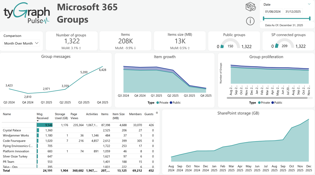
Time Period Comparison – A slicer that is used to select popular time comparisons such as month over month, year over year, and period over period, etc. which display the percentage change, along with a trend indicator arrow, in the fields below each card along the row.
-
Number of Groups Card – The total number of Microsoft 365 groups for the reporting period.
-
Number of Groups Trend displays the percentage change in groups along with the trend arrow depending on what is selected in the Comparison time slicer.
-
Items Card – Shows the total sum of e-mail items generated by all the Microsoft 365 Groups for the reporting period.
-
Items Trend – Displays the percentage change in e-mail items and is configured by the time comparison slicer.
-
Items Size (MB) Card – The total number of megabytes used by the e-mail items created by all Microsoft 365 groups for the reporting period.
-
Items Size Trend – The percentage change in megabytes used by the e-mail items from the Microsoft 365 groups for the time period selected in the slicer.
-
Public Groups Gauge – Compares “Public” groups to all groups. A public group is visible and accessible to all users.
-
SP Connected Groups – Compares Groups with an associated SharePoint site to all Groups.
-
Group Messages – Shows the total received emails across all Groups by Date hierarchy.
-
Item Growth – The total item growth across all Groups by Group type and the Date hierarchy. Group types include Private and Public Groups.
-
Group Proliferation – Shows the total number of Groups by Group Type and shown by Date hierarchy. Group types include Private and Public Groups.
-
Total Group level activity table– This table shows group activity status that include Msg Received, Storage Used (GB), Page Views, Activities, Items, Item Size (MB), Members, and Guests.
-
SharePoint Storage (GB) – Displays storage consumed for SharePoint Connected Groups shown by the Date hierarchy.
Email Usage
-
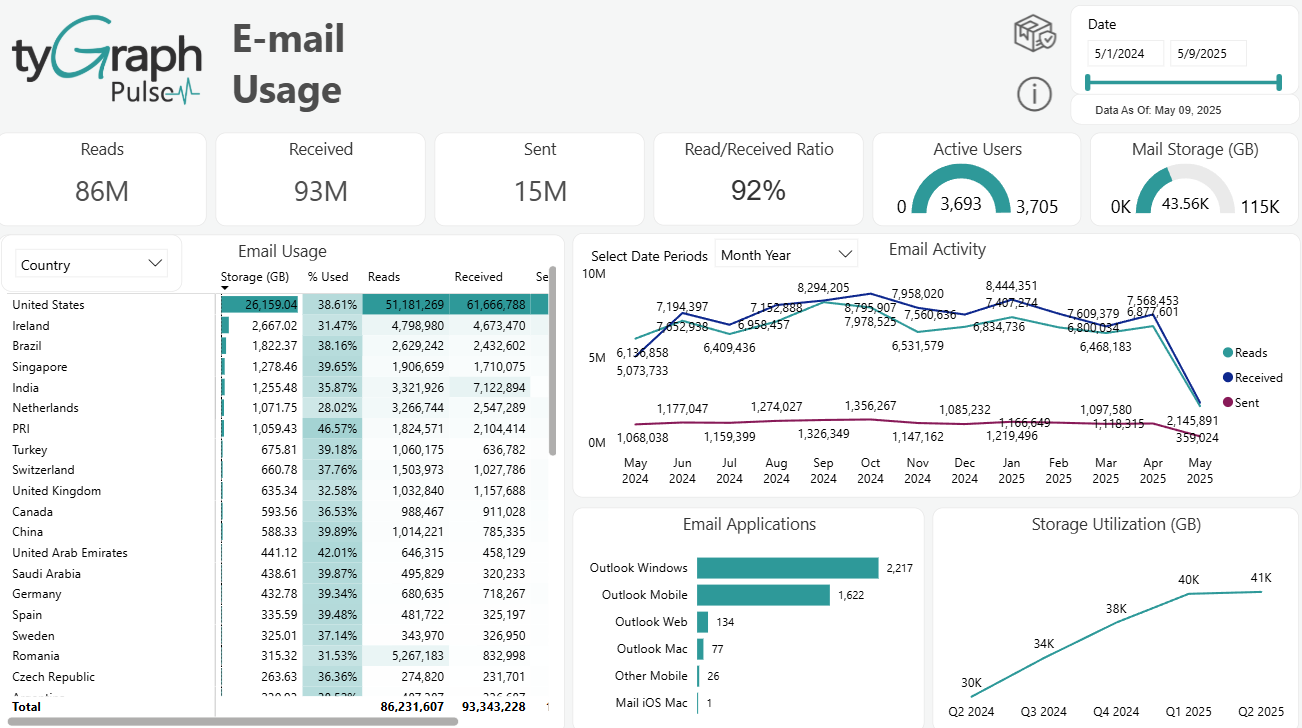
Reads Card – Shows the total number of emails read during the reporting period.
-
Received Card – Shows the total number of emails received during the reporting period..
-
Sent Card – Shows the total number of emails sent during the reporting period.
-
Read/Received Ratio Card – Emails Read divided by Emails Received.
-
Active Users Gauge – Compares active email users to all email users. For a user to be considered “active”, they must have read, received, or sent an email message.
-
Mail Storage (GB) Gauge – Compares the used email storage to the email storage limit for all email users. Expressed in gigabytes (GB).
-
User Property Slicer– This is populated with user attributes (Organization, Department, Job Title, Country, Region, and User Email) in your organization's Microsoft Entra ID, allowing for granular filtering of the below matrix.
-
Select Date Periods – Configures the x-axis by different date hierarchy on the e-mail activity line chart that it is embedded in. This replaced the classic Power BI drill down arrow icons for an easier user experience.
-
Email Activity – A line graph shows totals for different types of e-mail activity such as reads, received, and sent for all email users during the reporting period.
-
Email Usage – A dynamic matrix that is configurable by the User Property slicer that will display user level email usage activity and adoption.
-
Email Applications – Shows totals for different e-mail applications used for all users for the reporting period. E-mail applications include Outlook Windows, Outlook Mobile, Outlook for Mac, Outlook mobile, and Outlook on the web, etc.
-
Storage Utilization (GB) – Shows the total storage used by all e-mail activity over time. Expressed in gigabytes (GB).
Teams Activity
-
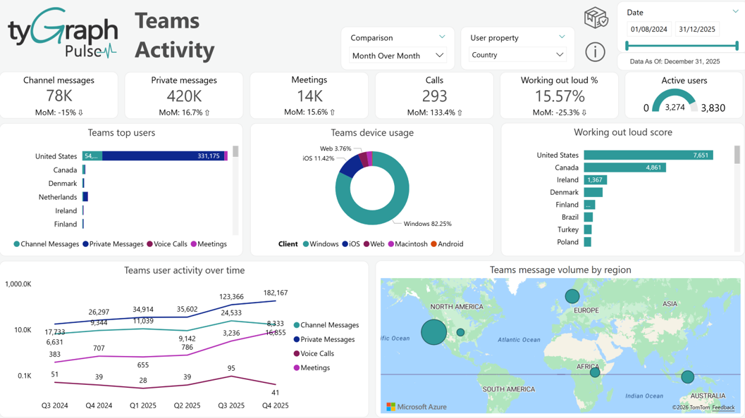
Time Period Comparison – A slicer that is used to select popular time period comparisons such as month over month, First vs Last full month, period over period, and year over year which display the percentage change, along with a trend indicator arrow, in the fields below each card along the row.
-
User Property – A slicer that will filter some of the visuals on this page by whichever user attribute is selected. This is populated from the data that is present in your organizational active directory.
-
Channel Messages – The total Teams Chat/Channel messages for the reporting period.
-
Private Messages – Shows the total user-to-user(s) Teams messages for the reporting period.
-
Meetings – The total Teams meetings for each user in the reporting period. When cross filtered to a user both meetings attended and organized. If three users attend the same meeting it would be counted three times, once for each user.
-
Calls – The total Teams voice calls for each user in the reporting period. When cross filtered to a user, this is both calls made and received. If three users participated in the same call it would be counted three times, once for each user.
-
Working Out Loud % – Benchmarks collaboration by calculating the ratio of Chat/Channel Messages for all Teams for the reporting period. This is expressed as a percentage.
-
Active Users – Compares active Teams users with all licensed users. For a user to be considered “active”, they must have received a Chat Message, a Private Chat Message, or participated in a Call or Meeting.
-
Top Teams Users – Shows user-level Teams usage activity and adoption insights.
-
Teams Device Usage – The average number of devices with usage for each client type each day. Each person/device/date combination is counted once. Device types include Web, Windows Phone, Android Phone, iPhone, iPad, and Other.
-
Working Out Loud Score – Benchmarks collaboration by calculating the ratio of Chat/Channel Messages for all Teams shown by Organizational hierarchy.
-
Teams User Activity – The total number of Chat Messages, Private Chat Messages, Voice Calls, and Meetings for all Teams users shown by the Date hierarchy. This can be navigated with the Up and Double Down arrows that appear when you hover over this visual.
-
Teams Message Volume by Geography – The total Teams messages shown by the geographical hierarchy. Teams' messages include Chat Messages, Private Messages, and Voice Calls. This can be navigated with the Up and Double Down arrows that appear when you hover over this visual.
Viva Engage Activity
-
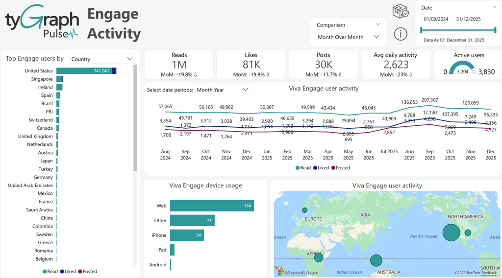
Time Period Comparison – A slicer that is used to select popular time period comparisons such as month over month, First vs Last full month, period over period, and year over year, etc. which display the percentage change, along with a trend indicator arrow up or down, in the fields below each card: Reads, Likes, Posts, and Avg Daily Activity located in the below row. You will see time intelligence comparisons in a percentage format.
-
Top Engage Users by user property – The total Viva Engage activity type shown by the user attributes. Engage activity types include Reads, Likes, and Posts. You can use the user property slicer for a very targeted filtering for the Top Engage Users report.
-
Reads – Shows the total number of Viva Engage Reads for the reporting period.
-
Likes – The total number of Viva Engage Likes for the reporting period.
-
Posts – The total number of Viva Engage Posts for the reporting period.
-
Avg Daily Activity – Shows the average number of daily Viva Engage activities. Viva Engage activities include Reads, Likes, and Posts.
-
Active Users – Compares active Viva Engage users and licensed users. For a user to be considered “active”, they must have Read, Like or Post activity.
-
X-Axis Date Slicer – This one can use to configure the date z-axis on the line graph it is embedded in. This replaces Power BI's native drill down arrow icons to provide an easier user experience.
-
Viva Engage User Activity – The total Engage activity by type over time. Engage activity types include Reads, Likes, and Posts.
-
Viva Engage Device Usage – The average number of devices with usage for each client type each day. Each person/device/date combination is counted once. Device types include Web, Windows Phone, Android Phone, iPhone, iPad, and Other (works the same as Teams Device Usage shown in the Teams activity).
-
Viva Engage User Activity Map – Shows the total Engage activity by user Location hierarchy. This can be navigated with the Up and Double Down arrows that appear when you hover over this visual.
SharePoint Sites
-
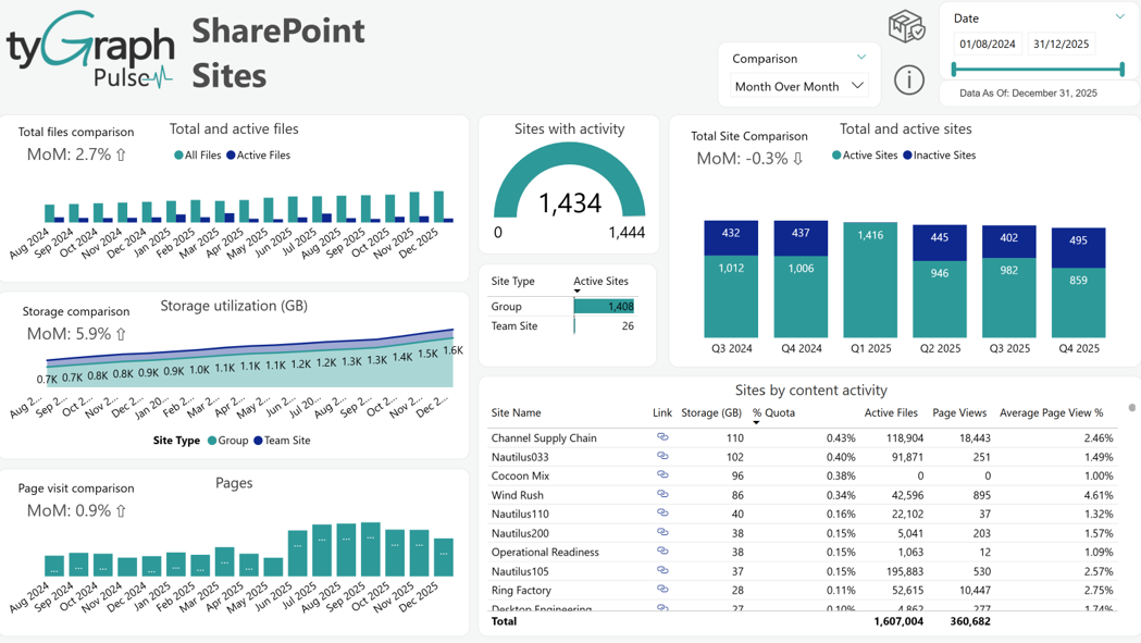
Time Period Comparison – A slicer that is used to select popular time comparisons such month over month, First vs Last full month, period over period, and year over year, etc. which display the percentage change, along with a trend indicator arrow up or down. This will display in the fields that are embedded in the following graphs: Total and Active Files, Storage Utilization, Pages, and Total and Active Sites.
-
Total and Active Files – Displays active files and the total number of files across all sites shown by the Date hierarchy. For a file to be considered “active”, it must have been saved, synced, modified, or shared.
-
Sites with Activity – Compares active sites to the total number of all sites. For a site to be considered “active”, there must be file activity (saved, synced, modified, or shared) or page views within the site.
-
Total and Active Sites – Displays active/inactive sites out of the total number of sites. For a site to be considered “active”, there must be file activity (saved, synced, modified, or shared) or page views within the site.
-
Storage Utilizations (GB) – Shows the total storage consumed by the site template shown by the Date hierarchy.
-
Site Type – A small matrix that displays the category of site type such as "Group" or "Teams Site" and its corresponding activity.
-
Pages – Shows the number of page views across all sites shown by the Date hierarchy.
-
Sites by Content Activity – Shows the site details around storage usage and activity, Total active files, storage used, and storage quota%,etc.
SharePoint User Activity
-
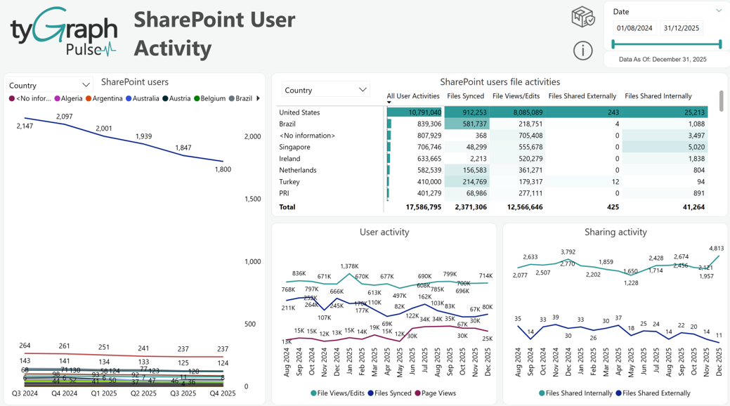
User Property slicer for SharePoint Users line chart and SharePoint Users File Activities matrix – A granular level filter that is dynamically populated with your organizational departments, locations, and other user attributes allows for very targeted filtering of all the visuals on the page.
-
SharePoint Users– Displays total SharePoint users by selected user attributes over time. You can drill into the date hierarchy by using the common Power BI drill down arrows by hovering your mouse over the visual.
-
SharePoint User File Activities – This matrix shows the sum for each file activity type, which are: All user activity, files synced, file views/Edits, Files Shared externally & internally. This matrix can be customized by the user to display totals for each by User Attributes.
-
User Activity – This line chart shows the sum of all SharePoint users' activity by file activity type over time. The date hierarchy offers the standard Power BI drill down ability.
-
Sharing Activity – Shows the total number of files shared internally and externally shown by the Date hierarchy. A file share is considered “external” if the recipient is someone outside of your Office 365 subscription.
OneDrive Usage
-
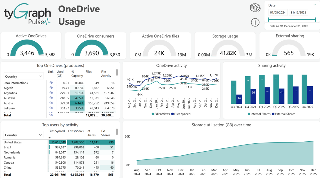
The following visuals on this page are configurable using the new "User attributes" slicer that allows for custom configuration of each visualization that is embedded into. It is present in the following visuals: Top One Drives (producers) and Top Users by Activity.
-
OneDrive Consumers – Compares active OneDrive users to licensed users. Any user with the following activities: viewed, modified, uploaded, downloaded, shared, or synced files are considered as “active”.
-
Active One Drives – Compares active One Drives to the total number of One Drives. Any OneDrive on which users viewed, modified, uploaded, downloaded, shared, or synced files is considered “active”.
-
OneDrive Consumers – Compares active OneDrive users to licensed users. Any user with the following activities: viewed, modified, uploaded, downloaded, shared, or synced files are considered “active”.
-
Active OneDrive Files – Compares active OneDrive files to the total number of OneDrive files across all. A file is considered “active” if it has been saved, synced, modified, or shared.
-
Storage Usage – Compares the total amount of storage used by all users in OneDrive to the total amount of storage allocated for the reporting period.
-
External Sharing – Compares the total number of externally shared OneDrive files to the total number of internally shared OneDrive files for the reporting period. A file share is considered “external” if the recipient is someone outside your Office 365 subscription.
-
Top OneDrive (Producers) – Shows user level summary listing of OneDrive information.
-
OneDrive Activity – Displays OneDrive edit/view and file sync activity across all One Drives.
-
Sharing Activity – Displays the total OneDrive internal and external sharing activity across all One Drives.
-
Top Users by Activity – Shows user level summary of OneDrive activity including files synced, edits/views, internal shares, and external shares by different user attributes for the reporting period.
-
Storage Utilization (GB) Over Time – Displays total OneDrive storage utilization shown by the Department hierarchy across all One Drives.