
Home > tyGraph Support Articles > Power BI Fundamentals
Download this articlePower BI Fundamentals
What Is Power BI?
Power BI is Microsoft's data visualization and analytics platform. It includes several applications and services that work together. For tyGraph users, the most important distinction is between Power BI Desktop and the Power BI service.
Power BI Desktop is installed locally and is used to build reports. Those reports can then be published to the Power BI service, which is used to view and share reports in Microsoft 365.
Where Can I Find Power BI?
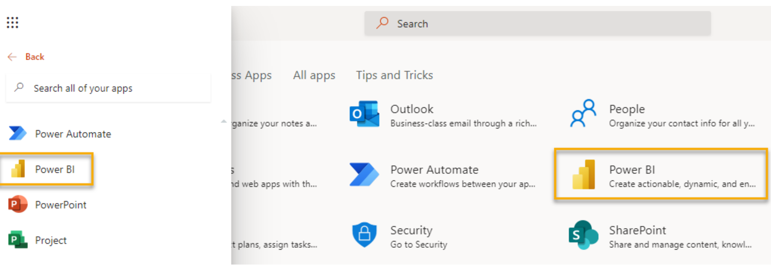
You can access the Power BI service from the Microsoft 365 app launcher. Power BI Desktop is available as a free download from the Power BI Desktop website.
Dashboards, Reports, and Datasets Explained
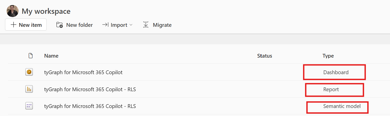
Dashboards, reports, and semantic models are the building blocks of most Power BI solutions.
-
Semantic models are the foundation of the solution. In tyGraph, the dataset acts as the dedicated data store that contains your Microsoft 365 usage and analytics data.
-
Reports are built on top of the semantic model. They answer analytical questions through charts, tables, graphs, and other visualizations. In tyGraph, reports are included as part of the deployment.
-
Dashboards sit on top of reports. They present selected, often pre-filtered visuals that highlight the metrics most important to you and your organization. In tyGraph, dashboards are also included as part of the deployment.
My Workspace, Workspaces, and Apps Explained
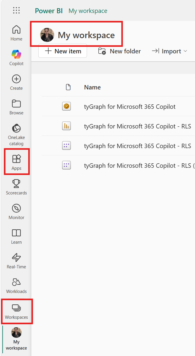
My workspace, Workspaces, and Apps are all locations in the Power BI service where you can store, access, and share Power BI content. Each serves a different purpose.
-
My workspace is your personal area in Power BI for your own reports and data.
-
Workspaces are shared collaboration areas where report authors and teams develop and manage solutions. In tyGraph, workspaces are often used to manage and share reports internally.
-
Apps allow you to distribute reports to users without giving them access to the underlying workspace. In tyGraph, apps are generally the preferred way to share reports broadly.
How to Navigate In and Between Workspaces
-
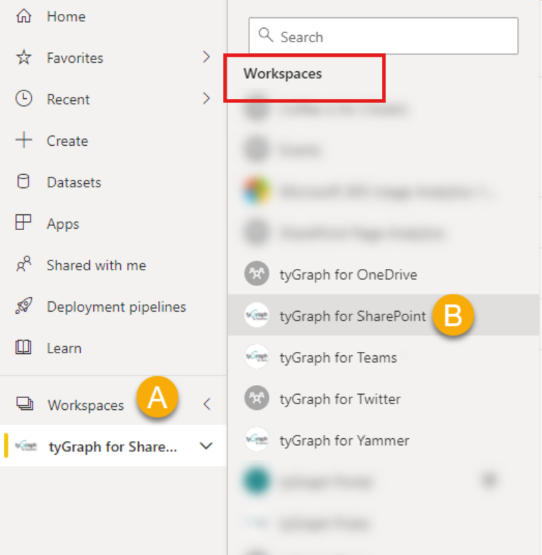
Click Workspaces to display the workspaces you can access. You may also see Microsoft 365 groups listed in this area.
-
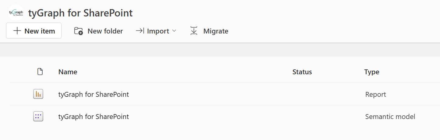
Select the target workspace to open it and view the dashboards, reports, and semantic models it contains.
-
Select a dashboard, report, or semantic model to open that item.
-
Click the workspace name to return to the workspace overview.
How to Navigate Between Apps
-
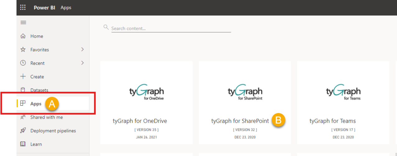
Click Apps to display the apps you have installed or that have been shared with you. If you do not see any apps yet, they may not have been installed or shared.
-
Select the target app to open its default dashboard.
-
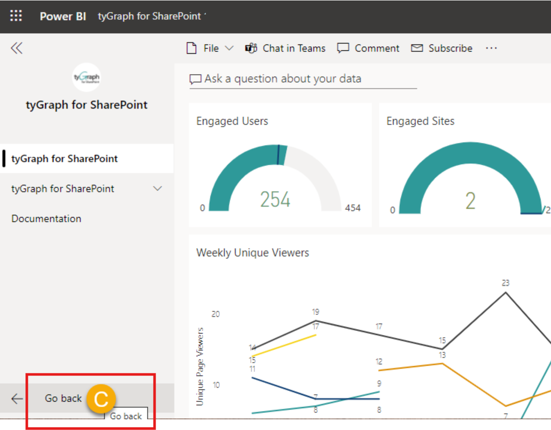
Click Go back to return to the app home screen.
How to Work with Reports
Power BI reports are made up of tabs, data visualizations, and filters. These tools help answer analytical questions while still allowing you to explore details and refine the data shown.
Report Navigation
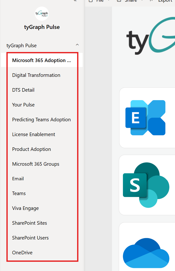
Power BI uses tabs to group related information. Click a report tab to move between report pages.
Interacting with Report Data Visualizations
Most data visualizations include some of the following controls:

-
Help tip: Displays contextual information about what the visual is intended to show. Most tyGraph visuals include this help text.
-
Drill up: Moves up one level in a hierarchy. For example, from Province or State to Country.
-
Drill mode: Lets you move up and down within a hierarchy after it is enabled.
-
Go to the next level in the hierarchy: Moves down one level. For example, from Province or State to City.
-
Expand all down one level in the hierarchy: Expands the hierarchy further, such as moving from Province or State to Postal Code or ZIP Code without stopping at City. Not all visuals include a hierarchy. If drill controls are shown, a hierarchy is available.
-
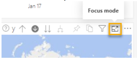
Focus mode: Maximizes the visual so you can review it in more detail. Click Back to report to exit Focus mode.
-
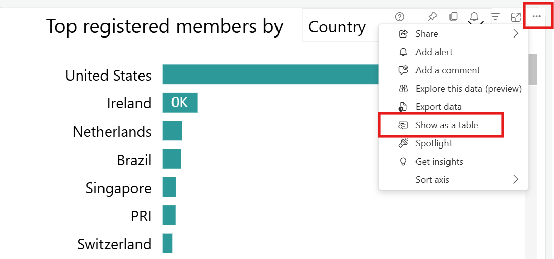
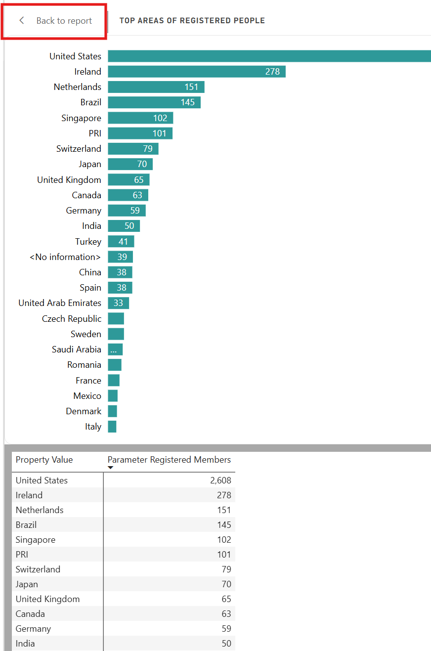
Show as table: Displays the underlying data values for a visual. Click More options, then select Show as table.
-
Click Back to report to exit Show as table mode.
-
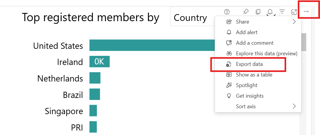
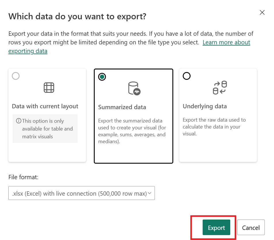
Export data: Exports the data from a visual, typically in Excel format. Click More options, then select Export data.
Filtering and Resetting Reports
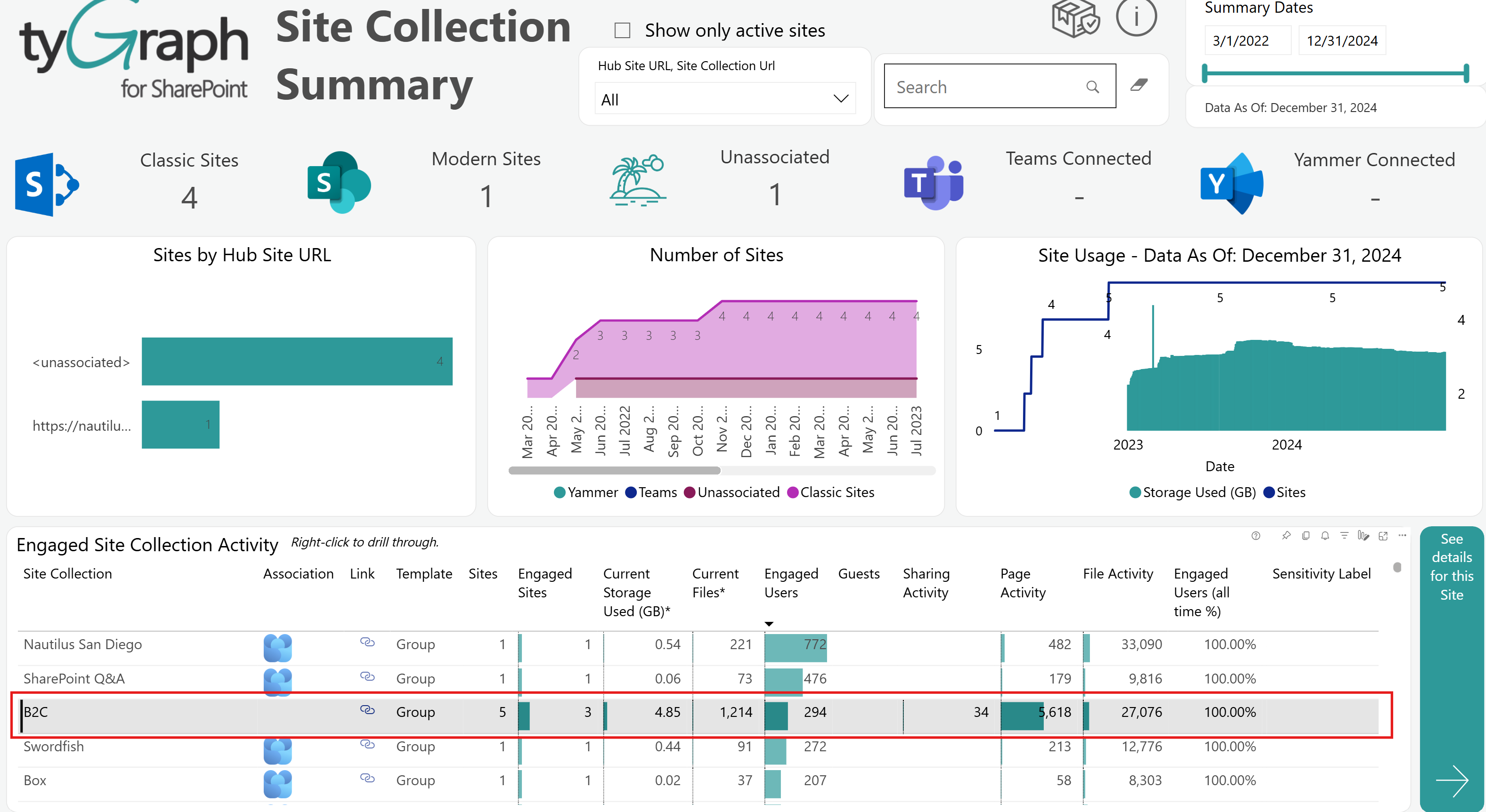
Cross-filtering in Power BI lets you filter an entire report page by selecting a value directly in a visual. For example, selecting the B2C site in the image below filters the other visuals on the page to that same value. Deselect the highlighted value to remove the filter.
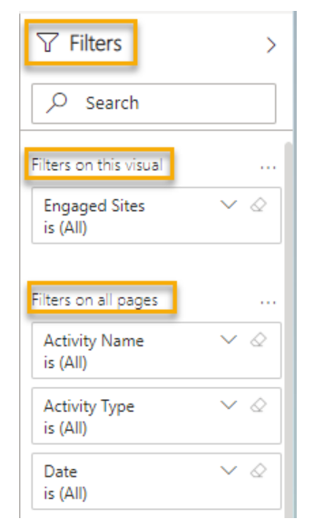
The Filters pane includes fields for the selected visual and any filters configured across the report pages by tyGraph.
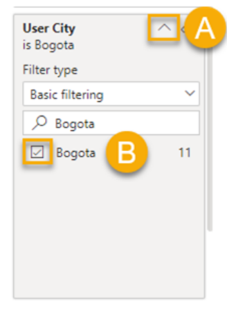
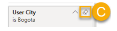
You can use fields in the Filters pane to refine the report further. For example, to filter by city:
-
Expand User City.
-
Select Bogota.
-
Click Clear filter to remove the filter.
Resetting Report Filters
Filtering is a powerful feature, but sometimes you may need to return the report to its default tyGraph state. Click Reset filters to restore the original report view.

Need Help Finding Your Dataset?
The dataset will be located in a specific workspace. Use the steps below to find it.
Search for the Workspace
-
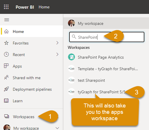
Click Workspaces in the left menu.
-
Search for the workspace name. In many cases, it will match the name of the app.
-
Click the workspace name.
Final Points
You can always return to the workspace overview to review the last refresh time, the next scheduled refresh, and the option to start a refresh manually. If you are unsure about the state of your dataset, this is the best place to check.
